DANL 200: Introduction to Data Analytics
DANL 200 - Midterm Exam - Example
Answers
Byeong-Hak Choe
2023-02-14
Loading R packages for the Midterm Exam
library(tidyverse)
library(skimr)
Question 1
For Question 1, run the following function to read the
county_data.csv file:
county_data <- read_csv(
  'https://bcdanl.github.io/data/county_data.csv'
)
You need to provide the absolute path name for the file,
dominick_oj_q1a.csv to the above read_csv()
function to read the file.
Variable Description
id: FIPS State and County codename: State or County Namestate: State abbreviationcensus_region: Census regionpop_dens: Population density per square mile, 2014 estimatepct_aa: Percent African American population, 2014 estimatepop: Population, 2014 estimatefemale: Female persons, percent, 2013caucasian: Caucasian alone, percent, 2013african_american: African American alone, percent, 2013travel_time: Mean travel time to work (minutes), workers age 16+, 2009-2013land_area: Land area in square miles, 2010hh_income: Median household income, 2009-2013fips: FIPS codevotes_dem_2016: Provisional count of Democratic votes in the 2016 Presidential election.votes_gop_2016: Provisional count of Republican votes in the 2016 Presidential election.total_votes_2016: Provitional count of votes cast in the 2016 Presidential election.partywinner12: Winning party, 2012 Presidental Election.
Q1a.
Move the column ‘fips’ to the first and remove column ‘id’.
q1a <- county_data %>%
  select(fips, everything()) %>%
  select(-id)
Q1b
Provide both (1) ggplot codes and (2) a simple comment to describe
the probability distribution of african_american.
ggplot(county_data) +
  geom_density(aes(x = african_american))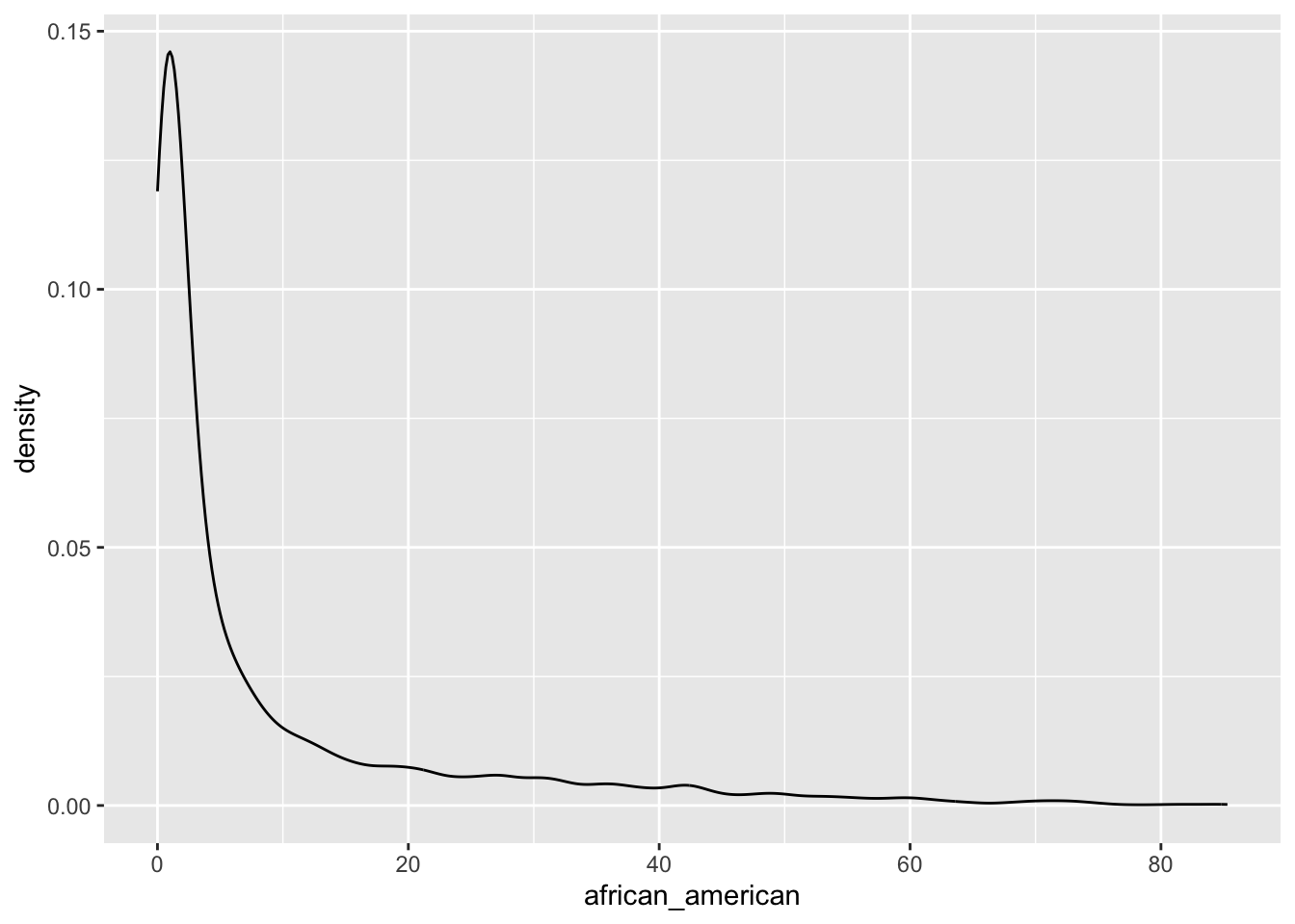
The distribution of the variable
african_americanis right-skewed.It ranges from 0.00% to 85.00%.
The values around 2-3% are most likely for the value for
african_americanin US counties.
Q1c
Provide both (1) ggplot codes and (2) a simple comment to describe
how the probability distribution of african_american varies
by census_region.
ggplot(county_data) +
geom_density(aes(x = african_american)) +
facet_grid( . ~ census_region)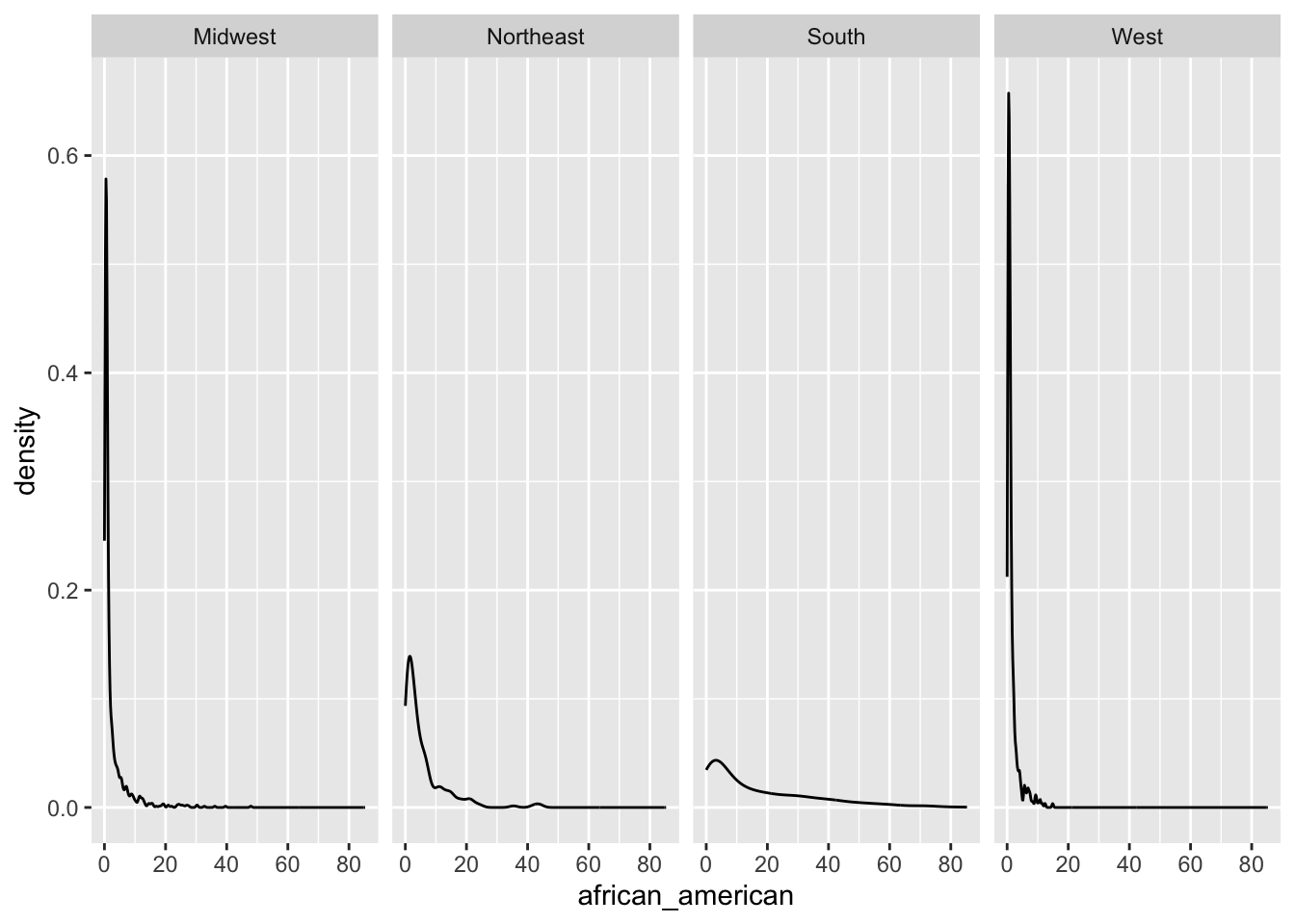 - The variable
 african_american are likely to be higher in
South and Northeast of
census_region than Midwest and
West of census_region.
Q1d
Provide both (1) ggplot codes and (2) a simple comment to describe
the relationship between travel_time and
hh_income.
ggplot(county_data,
       aes(x = travel_time, y = hh_income)) +
  geom_hex() +
geom_smooth() + geom_smooth(method = lm, color = 'red') 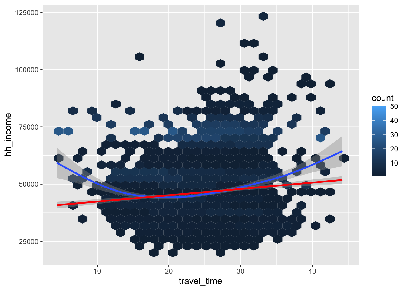
travel_timeandhh_incomeare negatively associated overall.- They are negatively associated initially, and the relationship
switches to be negative around the 22 minute of
travel_time.
- They are negatively associated initially, and the relationship
switches to be negative around the 22 minute of
Q1e
Provide both (1) ggplot codes and (2) a simple comment to describe
how the relationship between travel_time and
hh_income varies by pop_dens.
ggplot(county_data,
       aes(x = travel_time, y = hh_income)) +
  geom_point(alpha = .1) +
  geom_smooth() + geom_smooth(method = lm, color = 'red')  +
  facet_grid(.~pop_dens)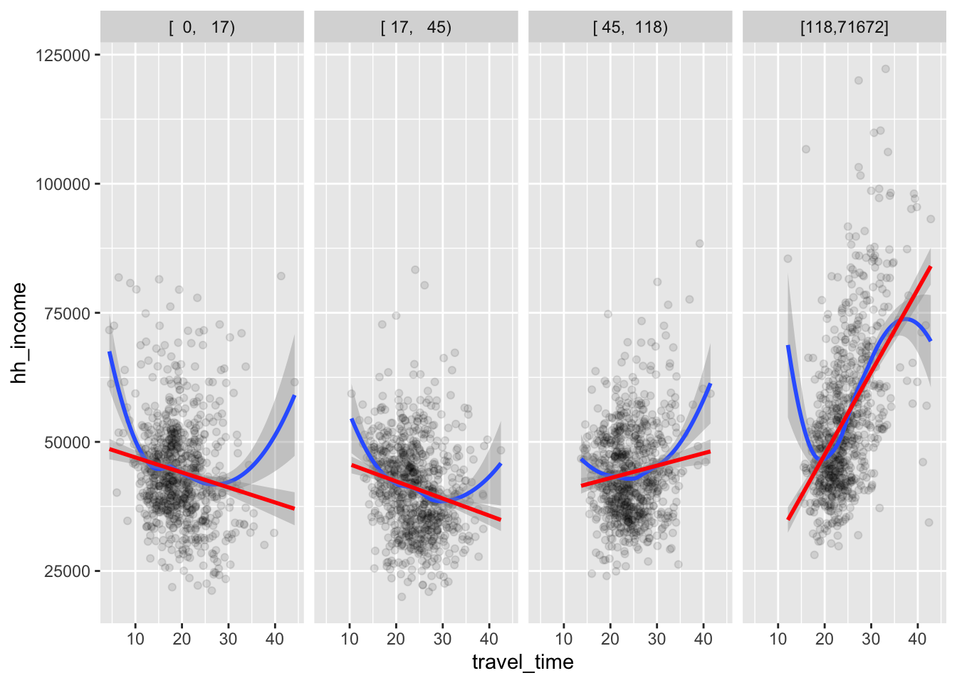
For low level of
pop_dens,travel_timeandhh_incomeare negatively associated.For high level of
pop_dens,travel_timeandhh_incomeare positively associated.The relationship between
travel_timeandhh_incomeseems to become more positive aspop_densincreases.
Q1f
Provide both (1) ggplot codes and (2) a simple comment to describe
how the relationship between travel_time and
hh_income varies by pop_dens and
census_region.
ggplot(county_data,
       aes(x = travel_time, y = hh_income)) +
  geom_point(alpha = .25) +
  geom_smooth() + geom_smooth(method = lm, color = 'red')  +
  facet_grid(census_region~pop_dens)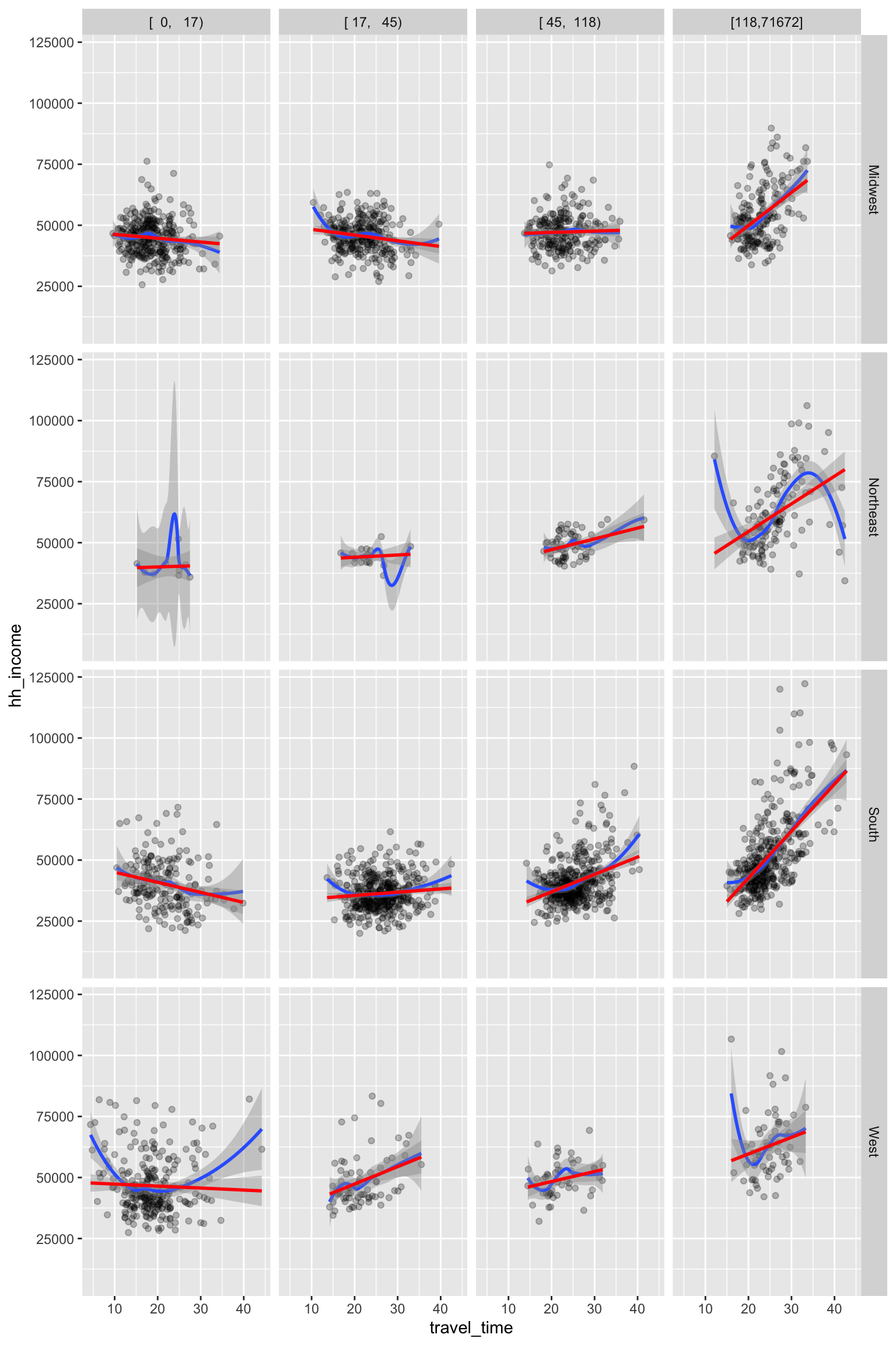
- Overall, the relationship described in Q1e holds across
census_region.
Question 2
For Question 2, run the following R command to read the music data file.
spotify_all <- read_csv('https://bcdanl.github.io/data/spotify_all.csv')
spotify_all
Q2a
Find the ten most popular song. Who are artists for those ten most popular song?
q2a <- spotify_all %>%
  count(artist_name, track_name) %>%
  arrange(-n) %>%
  head(10)

q2a- This example assumes that the most popular song is the song—a
combination of
artist_nameandtrack_name—that most frequently appears in the data.framespotify_all.
Q2b
- Find the five most popular artist.
- What is the most popular song for each of the five most popular artist?
q2b <- spotify_all %>%
  group_by(artist_name) %>%
  mutate(n_popular_artist = n()) %>%
  ungroup() %>%
  mutate( artist_ranking = dense_rank( desc(n_popular_artist) ) ) %>%
  filter( artist_ranking <= 5) %>%
  group_by(artist_name, track_name) %>%
  mutate(n_popular_track = n()) %>%
  group_by(artist_name) %>%
  mutate(track_ranking = dense_rank( desc(n_popular_track) ) ) %>%
  filter( track_ranking <= 2) %>%   # I just wanted to see the top two tracks for each artist
  select(artist_name, artist_ranking, n_popular_artist, track_name, track_ranking, n_popular_track) %>%
  distinct() %>%
  arrange(artist_ranking, track_ranking)

q2b
This example assumes that the most popular artist is the artist—the value of
artist_name—that most frequently appears in the data.framespotify_all.This example assumes that the most popular song is the song—a combination of
artist_nameandtrack_name—that most frequently appears in the data.framespotify_all.
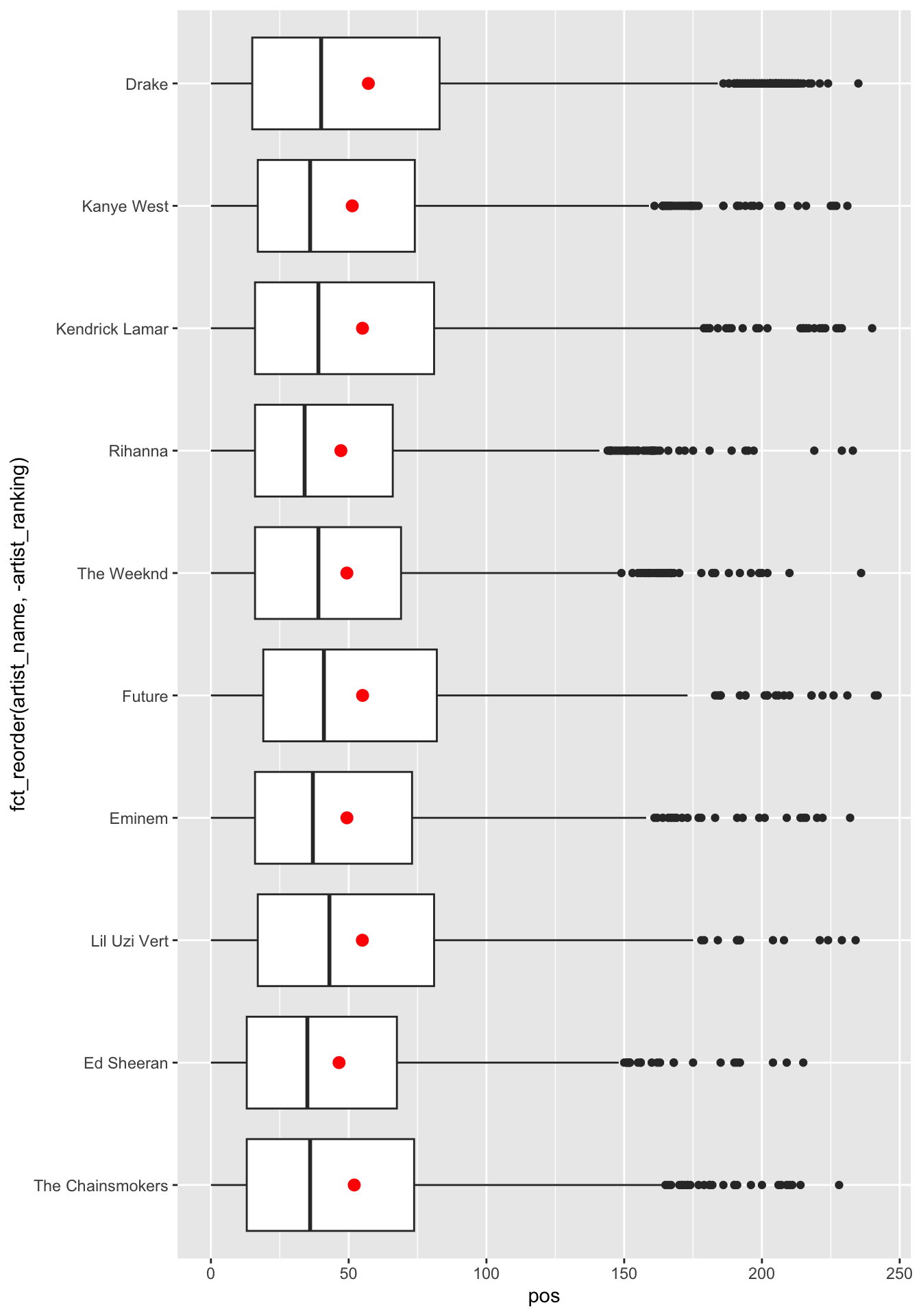
Q2c
Provide both (1) ggplot codes and (2) a couple of sentences to
describe the relationship between pos and the ten most
popular artists.
q2c <- spotify_all %>%
  group_by(artist_name) %>%
  mutate(n_popular_artist = n()) %>%
  ungroup() %>%
  mutate( artist_ranking = dense_rank( desc(n_popular_artist) ) ) %>%
  filter( artist_ranking <= 10)

# boxplot
ggplot(q2c,
       aes(x = pos, y = fct_reorder(artist_name, -artist_ranking)) ) +
  geom_boxplot() +
  stat_summary(
    fun = mean,
    color = 'red'
  )
# density
ggplot(q2c) +
  geom_density(aes(x = pos)) +
  facet_grid(fct_reorder(artist_name, artist_ranking) ~ .  , switch = "y") +
  theme(strip.text.y.left = element_text(angle = 0))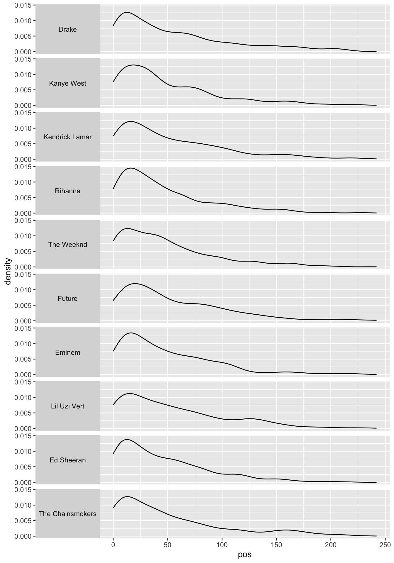
# histogram
ggplot(q2c) +
  geom_histogram(aes(x = pos), binwidth = 1) +
  facet_grid(fct_reorder(artist_name, artist_ranking) ~ .  , switch = "y") +
  theme(strip.text.y.left = element_text(angle = 0))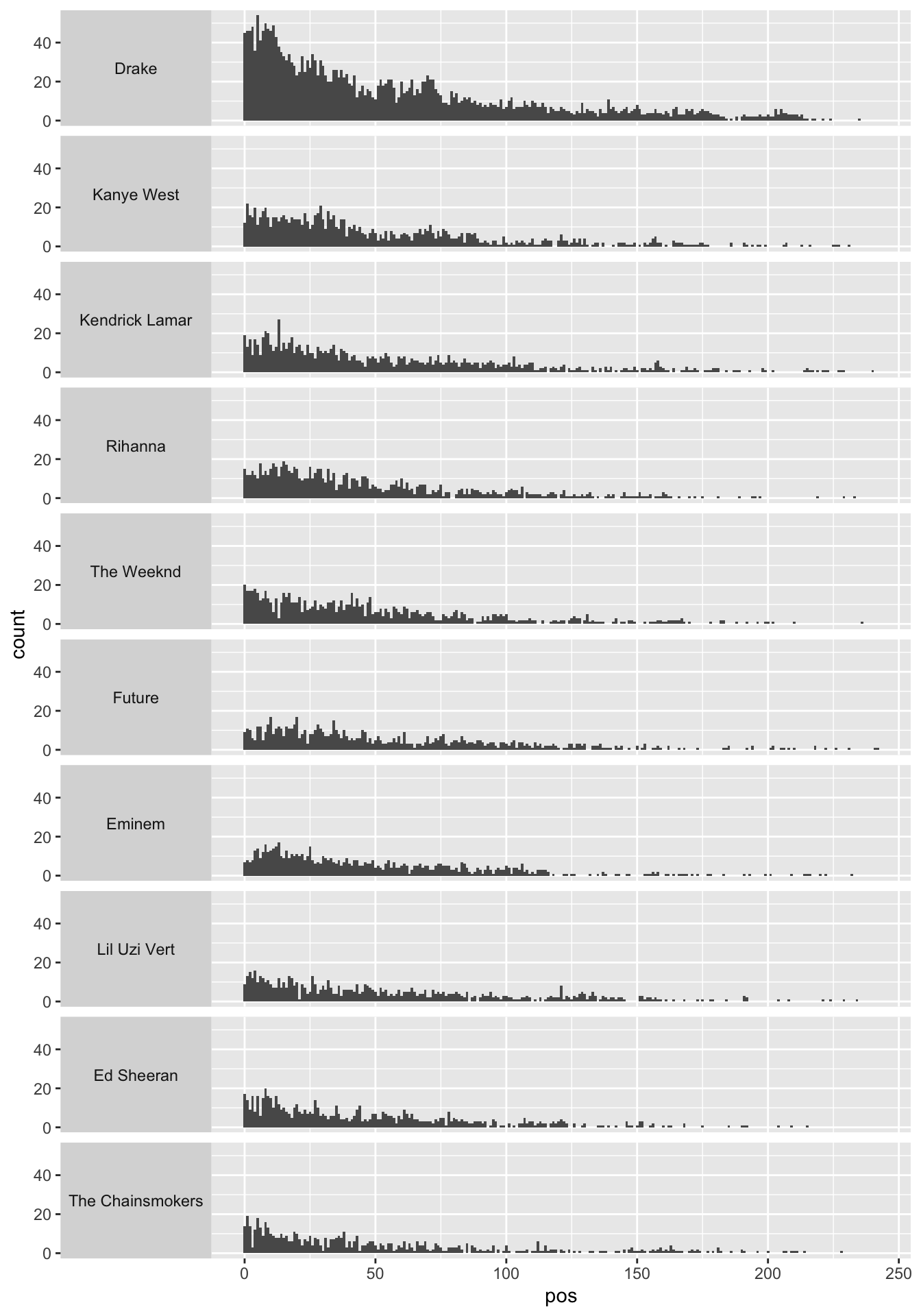
The relationship between
posand the ten most popular artists can be described by how the distribution ofposvaries across the ten most popular artists.The distribution of
posdoes not seem to vary a lot across the ten most popular artists.Anything noticeable can be mentioned.
Q2d
Create the data frame with pid-artist level
of observations with the following four variables:
pid: playlist idplaylist_name: the name of the playlistartist: the name of the track’s primary artist, which appears only once within a playlistn_artist: the number of occurrences of artist within a playlist
q2d <- spotify_all %>%
  count(pid, playlist_name, artist_name) %>%
  rename(n_artist = n) %>%
  arrange(pid, -n_artist, artist_name)

q2d
Question 3
Q3a
Download the compressed file,
ca_housing.zip, from the Files section in our Canvas web-site.Extract the file,
ca_housing.zip, so that you can use the file,california_housing.csv.Read the data file,
california_housing.csv, as the data.frame object with the name,ca_housing, using (1) theread_csv()function and (2) the absolute path name of the file,california_housing.csv, from your local hard disk drive in your laptop.
ca_housing <- read_csv(
  '/Users/byeong-hakchoe/Google Drive/suny-geneseo/teaching-materials/lecture-data/california_housing.csv'
)

ca_housing
Q3b.
Report the mean, median, minimum, maximum, and standard deviation for
the variable, medianHouseValue, in the data.frame,
ca_housing.
skim(ca_housing$medianHouseValue)| Name | ca_housing$medianHouseVal… |
| Number of rows | 20640 |
| Number of columns | 1 |
| _______________________ | |
| Column type frequency: | |
| numeric | 1 |
| ________________________ | |
| Group variables | None |
Variable type: numeric
| skim_variable | n_missing | complete_rate | mean | sd | p0 | p25 | p50 | p75 | p100 | hist |
|---|---|---|---|---|---|---|---|---|---|---|
| data | 0 | 1 | 206855.8 | 115395.6 | 14999 | 119600 | 179700 | 264725 | 500001 | ▅▇▅▂▂ |
Q3c.
Calculate the correlation between housingMedianAge and
medianHouseValue.
cor(ca_housing$housingMedianAge, ca_housing$medianHouseValue)## [1] 0.1056234